For my Senior Thesis at The College of New Jersey, I needed to create a brand logo for my project. Since creating the initial logo for the brand, I have continued to iterate and evolve it. I currently use the logo for this website, along with my 3D printing Instagram account.


Project Description
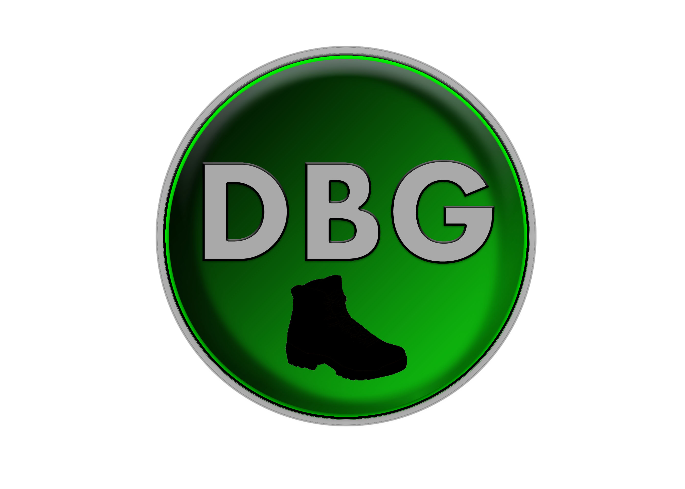
When I first was tasked with creating a brand for myself, my first thought was to relate to my video game username that I have been using for a long time, DIRTYBOOTGANG. Over the years, I have created a bunch of logos in Adobe Photoshop for my username, continuously evolving and tweaking the design of the logo. So after I created this new brand, Dirty Boot Productions, I used the current version at the time of my username logo as the first inspiration.
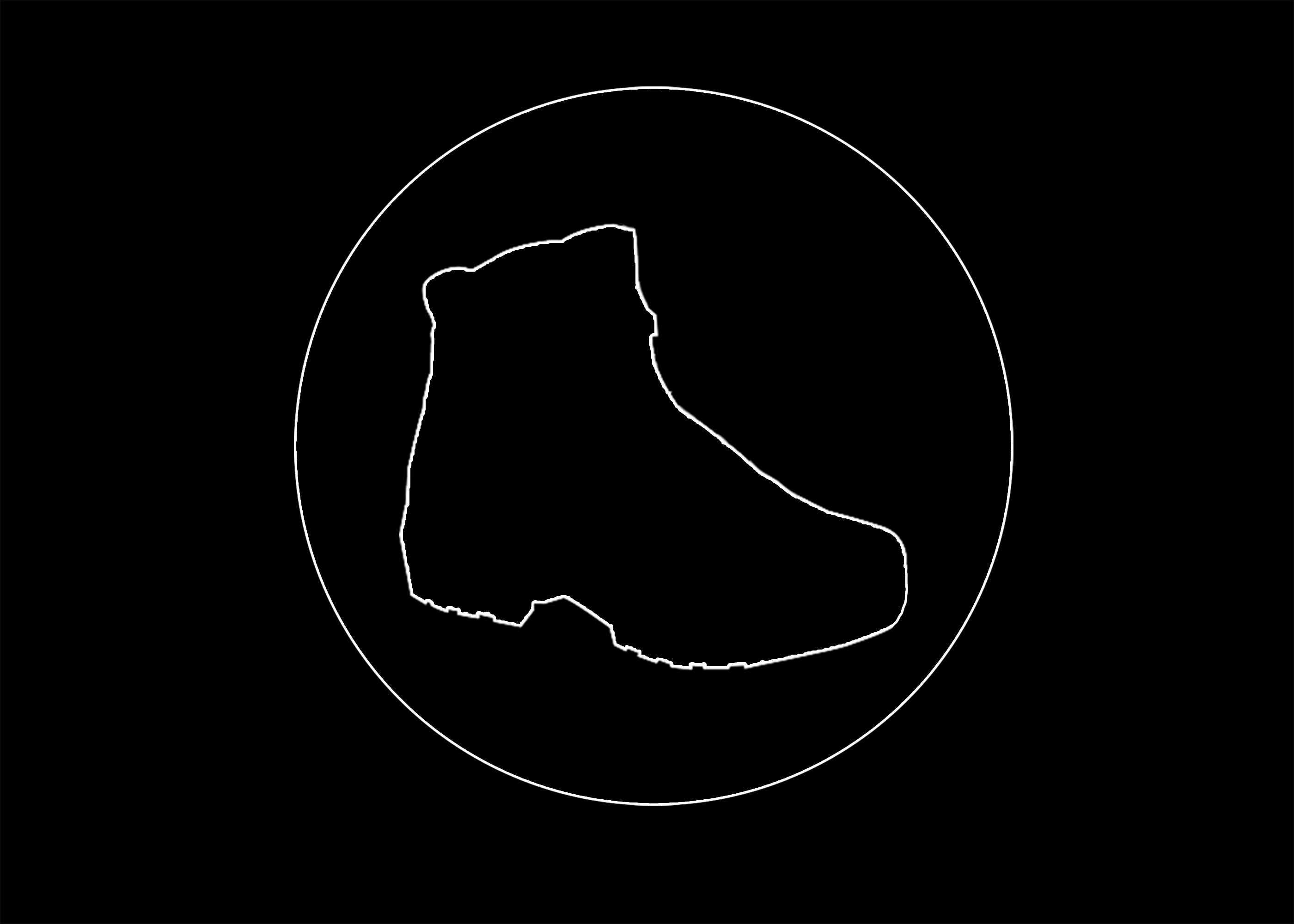
I knew before I started designing the first version of the Dirty Boot Productions’ logo, that I wanted it to be very simplistic in its design. To start, I stripped away the “DBG” text and color. From that point, I then took the boot icon, scaled it up, and gave it a thin white stroke. With the outer circle layer from the original logo, I just turned it black and applied the same stroke that I gave to the boot icon.
With this first version of the logo, I was pretty satisfied with how it turned out. After using the logo on a bunch of other projects I worked on during my Senior Year, including the Instagram account I had to make for thesis, which would later turn into my 3D printing account, I ended up using it on the initial version of my portfolio website on Google Sites. When I rebuilt my website on WordPress, I adopted a white, black, and grey color palette that went with the logo. When I decided to add more color to my website was when I decided to make the next version of the logo.
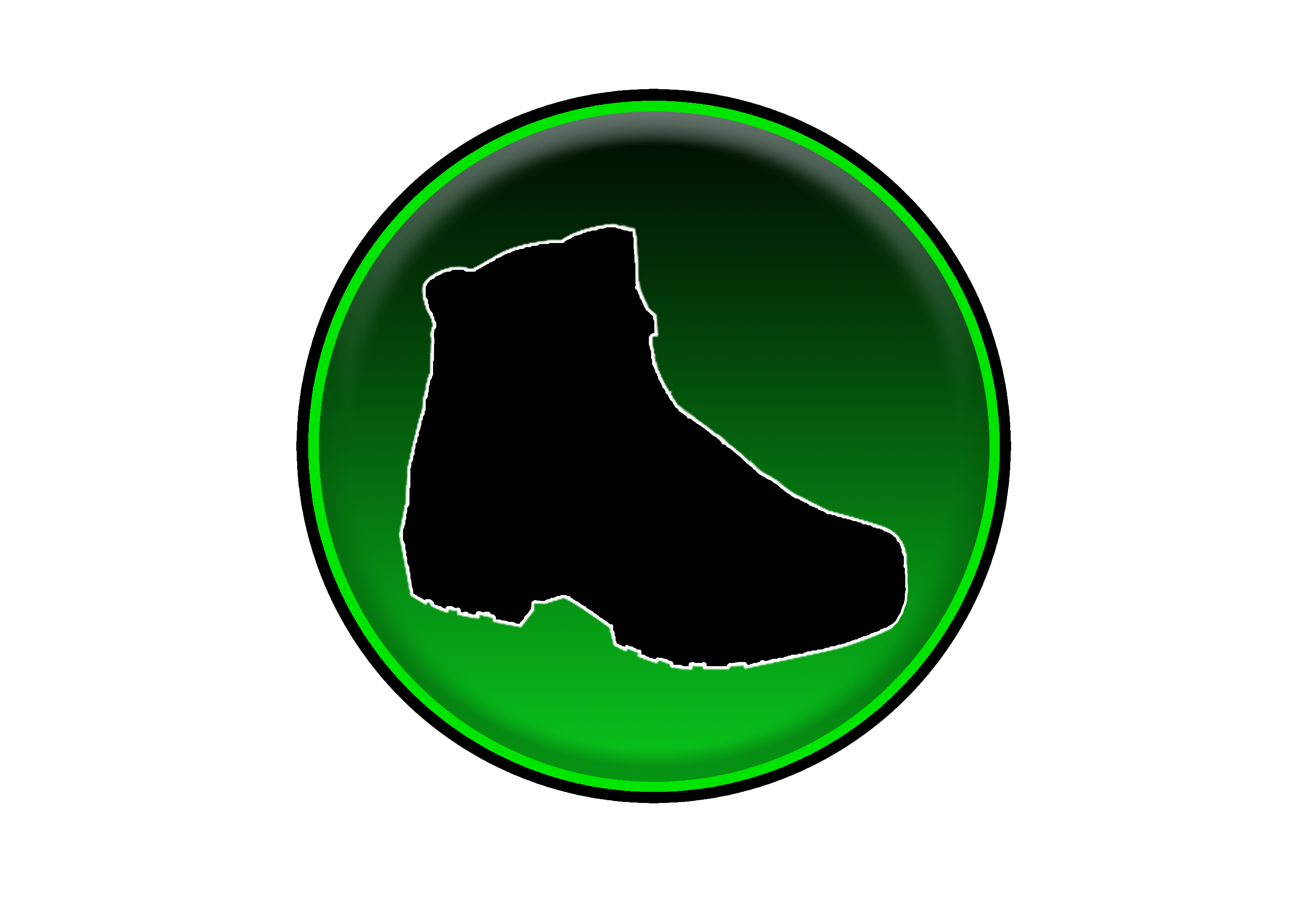
For the second version of the logo, I decided to go back and re-add the colors and gradient used in the initial username logo. Unlike the username logo, I did remove the grey circle layer and adjusted the bright green circle’s size to make it pop more. I also removed the thin white stroke on the outer black circle layer since I didn’t need it anymore. From this logo, I derived the color palette for the new version of my portfolio website. While I still use this logo for my website, I decided to go back and reiterate on Version 1 of the logo since I was still using it for my 3D printing Instagram account at the time.
When looking back on Version 1 of the Dirty Boot Productions’ logo, the one thing that I wanted to change was the stoke size since it just seemed too thin. This first came to my attention after I 3D printed keychains and coasters of the logo (which can be found here). After playing around with different stroke sizes, I ended up settling on a stroke size of 15 px. I did 3D print some keychains with this logo and they turned out much better than the initial ones that I made.
Over the time that I have spent working on all the different Dirty Boot Productions’ logos, it has helped me refine my Adobe Photoshop skills and taught me how to create a brand. I will inevitably continue to iterate and evolve this logo design and I’ll be sure to showcase any other versions in the future.
