When I was in the process of redesigning my portfolio website previously, I decided to use Figma to plan out how I would organize each of the pages on the website. With Figma, I was able to create mobile/web wireframes and prototypes of my portfolio website.
Project Description
Previously, I had made my portfolio website through Google Sites. After a while, I decided to rebuild my portfolio website on WordPress. Before I began to rebuild my website, I thought it would be good practice to make some wireframes and prototypes of my website through Figma. For the navigation bar, I wanted it to be split in half by the site logo (which I made previously with Photoshop for my brand Dirty Boot Productions) since I wanted to have dedicated About Me, Projects, Resume, and Contact pages. The site logo would link back to the home page as well. One other detail I wanted to include with the navigation bar was that when one of the navigation elements was selected, a green line would appear underneath, signifying the selected page. Regarding the page footer, I wanted to include links to my email, LinkedIn Profile, and 3D Printing Instagram account.
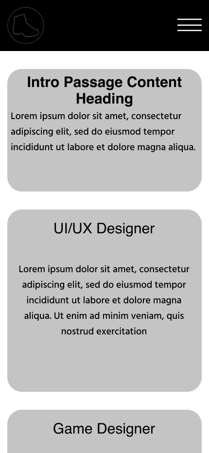
For the About Me page, I wanted to display a brief paragraph about myself and have a dedicated skills section where I could display my skills. With the Projects page, I organized the projects into specific categories, such as UI/UX Projects, Games, and Other Projects. By hovering over a project image, the name of the project would appear, along with a button linking to the project’s associated page. With the Resume page, it would simply display my resume. The Contact page, I simply displayed the links that were already in the page footer, but I also added in my phone number as well.
In regards to the color palette used in the prototypes of my website, I used the site logo as a source of inspiration by using black and white. I also wanted to include a shade of grey to create some contrast with the black and white. For a highlight/hover color, I went with a bright green because it’s my favorite color and it really stood out against the black and grey background colors. While this was the initial version of my portfolio website, I was able to learn a lot from my previous design choices and have since updated my website significantly, both in element layout and in visual appearance.
You can view the project files directly via the button below or select from the different interactive previews at the bottom of the page.
Interactive Previews