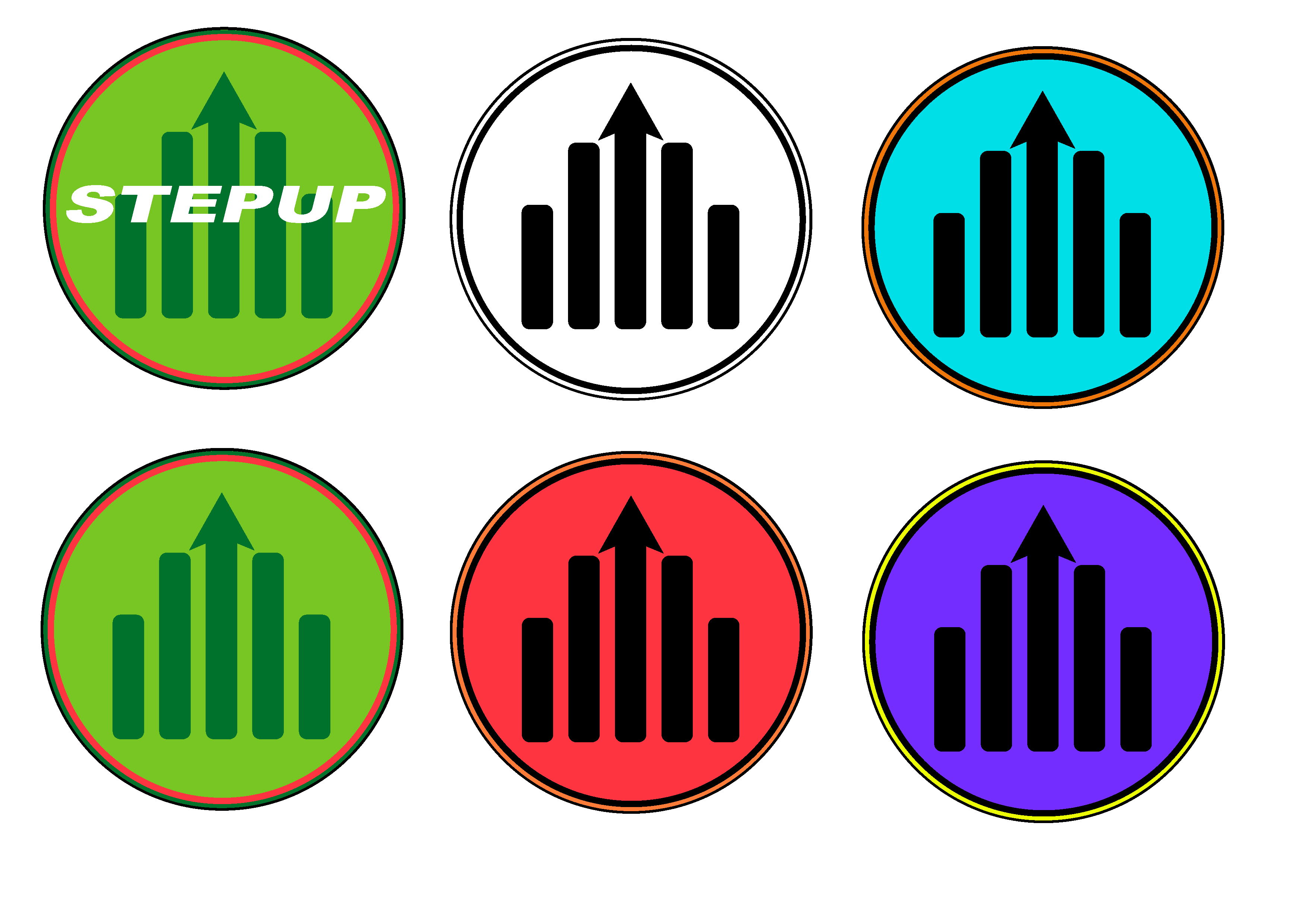
These logos I made for a graphic design job that I had applied to previously. The assignment was to make logos for a Sports Athleisure Brand using a group of sample images as a source of inspiration for the logos.


Project Description
When I first started making these logos in Adobe Illustrator, I noticed a couple common themes with the sample images, such as they were all pointing/leading in an upward direction and the jagged shape of the arrows. Some of the common colors I noticed in the sample images were black, red, orange, and green. I made sure to incorporate these shapes and colors into the logos I made.
Since the logos were going to be for a sports athleisure brand, I wanted the name of the brand to sound sporty. I came up with the name Stepup based off of the arrows and rectangle sample shapes looking like a set of steps. Stepup also sounded like a brand that encouraged self-improvement through athletic activities.
For my first batch of logos, I wanted to really lean into the idea of the logo being in the shape of steps. I also wanted to try and incorporate an arrow into the design to tie it back to the sample images. I tried orienting the placement of rectangles into the shape of steps to emphasize and tie back to the brand name. I also tried making logos simply out of text. I reused the font I had used in some of the previous logos, but I turned the “T” into an arrow to make it stand out.
I also experimented with having the arrow in the center of the logo, surrounded by rectangles. My first attempt with this idea was with the logos in the top right corner of the first group. I thought it would be an interesting idea of making the background of these logos a crest shape just to try something different than I had done before. For most of the logos in the first group, I kept them simply black and white just to get an idea of the basic shape and look before introducing color to them. I mostly focused on green just because of the prominence it had in the sample images.
As for the second group of logos, I wanted to take the circle logo I made in the first group and expand on it in different colors. For the green logos, I tried to incorporate the colors from the sample images. I chose to add the text to the one logo just to see how it would look. The red logo I created using the red and orange from the similarly colored sample image. The blue and purple variants of the logo I simply made just to experiment with other color combinations.
Overall, I feel that this assignment was a nice test of my skills with Adobe Illustrator that challenged me into thinking differently about how to make a logo.
